Hundreds of companies presented at Y Combinator’s Winter 2022 Demo Day event, and I looked at pretty much all their logos. There’s a lot of solid ones, a few clunkers and a handful of really nice ones. Here’s a list of the latter for your pleasure and edification.
I haven’t put these in any order — in fact the order they appeared in when I put the images in the post was a complete surprise. Let’s go!
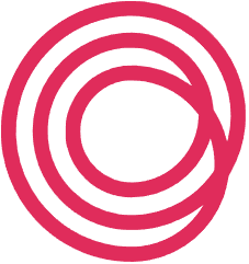
Circular: With a shape specified right there in the company name, you’d think they’d go full circle, so to speak, but this loopy spiral thing is a way better choice in my opinion. The company does recycling, if I remember correctly, so the idea of a more complex loop, and connecting one end to another, is apropos. Not only that, but by doing it this way you hide a C in there as well. The cranberry (mulberry?) color is a solid choice too. Wait… I just realized it’s the Life360 logo rotated about 40 degrees. Well, there’s nothing new under the sun, it seems, and honestly this one is better. Admittedly not the best start for the list, but I didn’t pick the order.
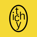
Itchy: I like this particular configuration of the letters in a sort of sticker format, but elsewhere they do the type differently. But the idea everywhere is one of slight disorder and unease, which is of course also suggested by the name. Since they make a cream for irritated skin, it’s a frank acknowledgement of the problem, refusing to dance around it with a medical or aspirational name. Unusual, but potentially smart branding choice for a skin-care company.
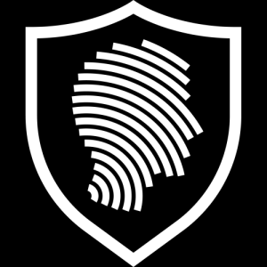
Reality Defender: There were a few fingerprint or biometric-type logos in this batch, but this is the best one. It shows identity, impersonation and protection all at once, leaving the specific interpretation up to the viewer. I have to hand it to the artist for picking the right “quadrant” of a fingerprint to be able to suggest facial features without looking too weird. Plus it “goes” left to right, which helps it track.
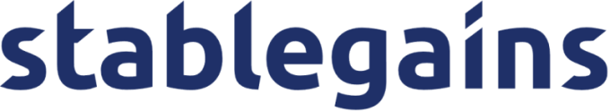
Stablegains: This is a great logotype. Aligning the letter cuts to the same degree makes for a cohesive look, but they didn’t take it too far, letting the G’s descender and various other tails stay natural. It’s also a good typeface for a logo at this size, where you can see the unusual styling of the curves on the letters. From a distance it just looks bouncy but a bit sharp, and after only a few seconds you have something really recognizable.
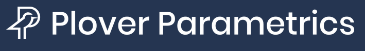
Plover Parametrics: Putting an animal in the logo is always a risk, since it can easily be too cute or too detailed, drawing too much attention. Plover does it just right with a little bird that’s not only well drawn and, with its little legs, recognizable as a shore bird, but simultaneously forms the stem of the P and defines its negative space without interfering. I doubt it’s the first bird-based P logo out there, but this is a nice one. I wonder if they should have aligned the tail horizontal with the horizontal from the bottom of the P curve… nah. It would make the bird too flat.
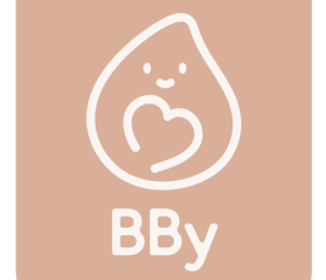
BBy: This soft, cute droplet simultaneously suggests motherhood, babyhood, caring and liquid; quite a feat. The color I imagine is meant to suggest skin, and it does to a certain extent, but you always have to be careful with that, as using one skin tone excludes others.
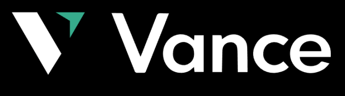
Vance: This is a simple one, but a V is best for directional logos — in this case up and to the right, suggesting profits, while the green suggests go, money and all that positive stuff. The thick ribbon-like V slash is also different enough from the thin V in the type that it doesn’t seem redundant. I’d go with a more geometric font though. (And once you see the logo as a mint-licorice candy corn, you can’t unsee it. Sorry!)
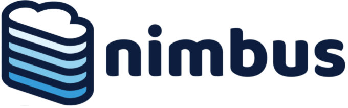
Nimbus: Stacking and gradients were common in this batch, and Nimbus was my favorite of them. The cloud icon is incredibly common these days and has its own connotations, but the proportions of this particular stack and gradient, with the thick line work, make it seem more substantial and cohesive. The type is good too, mirroring the lines of the logo and also making the whole thing soft and fluffy. You know… like a cloud. But you got that already because it’s a good logo!
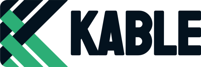
Kable: First of all, love the type. And it was the right decision (if it was one) to join the K and A (and what an A!) and control the white space. The bouncing or curving ribbons/chevrons are interesting and form a nice K shape, though it is a bit busy. I wonder if it could be simplified or condensed a bit to make it seem less tangled.
![]()
Enlightra: A little form meets function here. I’m not in love with the type but I think the logo does a lot once you know the company is doing laser-based data transfer. The spike is right out of a spectrogram and the waves coming out of it are like Wi-Fi, so it’s a frequency that’s sending data… all wrapped up in a nice little circle. That’s clever, though it helps to understand what they do first.

Paycrunch: I’m not completely sold on this one, but this is one logo that, if the app takes off, will be immediately recognizable from a distance. In a way it’s just a weird F… but the tilt helps your mind see it differently. Sometimes when you have that two-letter synthesis option, you just have to commit and hope simplicity pays off.
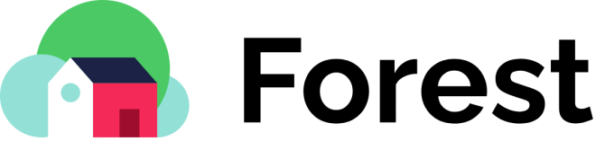
Forest: I just like the proportions on this one. I’m not sure it suggests a forest at all, but it does do homes and clouds, which is more to the point anyway. The house position and the door are very slightly off-center, which combined with the smallest circle emphasizes the perspective while staying totally flat. Details matter!
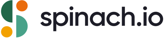
Spinach: The color choices here are great, and these shapes all stand out despite each being a close muted shade to its sibling. The S is suggested elegantly and creatively, and along with the name the viewer is also reminded of leaves and fruit, food servings and portions (a halved head of lettuce and two tangerines… see it?). I can’t remember what this company does but that’s probably intentional. (Actually, it’s something about doing remote meetings, so… unsure.)
There you have it! Pretty good logos, right? You can check out our more substantial coverage of the companies in this batch here.
from TechCrunch https://ift.tt/yXwbcgZ
via Technology
Comments
Post a Comment